In this blog we are going to discuss about website designing and how it is growing day by day.
It is one of the most fascinating never ending and highly creative career options.
Each and every company is looking for fresh talents every year to showcase their products or access information.
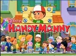
To create a business,brand or reach greater heights website designing is becoming popular and more and more people are opting for this profession.
Web Designers plan , create pages, and combine texts with sounds, video clips, picture ,graphs and other interactive factors to make the website look more appealing.
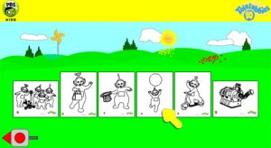
Websites are the first and foremost point of connection between the company and it users.
It is the process of conceptualizing and arranging content for the internet.
In today’s world website designing goes beyond the aesthetic level to reach functional level.

Different factors like fonts, colours, layouts, shapes, images ,icons, videos, navigation ,speed, animation all are important factors in website designing specially when it is for kids.
Humans especially kids are stimulated by a number of factors which in away are related to their personality and interest.
So when website designing is done for kids one has to keep certain factors in mind.
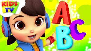
Targeting the specific age group is very important as kids are too smart.
They won’t like things which are too baby like or some contents which have deeper meanings making it difficult for them to understand.
Bright colours can hold a child’s attention and create an long lasting impression on the child’s mind.
These colours should be used wisely as they are the first thing a child would notice in a website.
Primary colours always are a big hit with kids as they make the website look more appealing.
Colours like yellow, red and blue are some popular options which makes the website look more bright and interesting for kids.
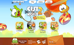
Few websites make use of bright and saturated colours for the foreground and less saturated colours, tones and gradients for the background.
Images should have a more humane look with deeper colour schemes.
Creating a palette which is bright ,cheerful and fun gives the website its unique look.
Young minds like bright colours, cute characters and natural elements.
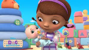
Designs which are being created by these web designers to get more depth like shadows,landscapes, shiny gradients, floating objects.
In most of these kids websites the inside of these houses are being shown with more three dimensional elements like windows, doors, stairs etc.
In few of these houses rainbows are shown which the characters see from their windows and it makes it more fun and attractive for the kids.
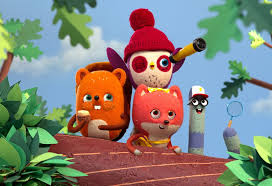
Use of horizontal navigation bars makes it easier and simpler for the kids to understand and use it over and over again.
Some graphic based navigation bar also makes it more ideal for kid’s website designing.
These websites which are designed for kids should be more interactive where they can play games, be entertained without spending more time on reading the instructions.
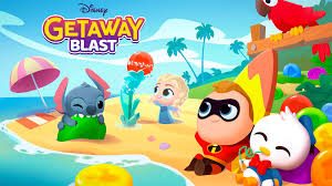
Few websites also have options where kids can play with their imagination and be more creative with their own designs which also gives them a sense of satisfaction.
Their experiences in life are limited and things with which they are familiar are only found in nature like tree, snow, flowers hills, rivers ,bright colourful sun, lovely flowers, butterflies and cute animals.
We while website designing for them has to ensure we all all the elements.
The sizes can be overemphasized based on the requirement.
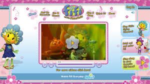
The next thing which can hold a child’s attention is happy mood as they would only like to go to that website to be happy and cheerful.
Looking at the body language of Mickey Mouse who is always there with a beautiful smile on his face kids forget everything and get glued to the screen.
It can actually bring a smile on their faces.
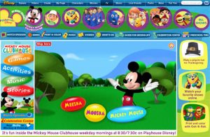
Animated characters are always being liked by kids as they can relate to these characters.
The characters from Disney and Peppa Pig are always smiling as if they are talking to the kids who are watching them.
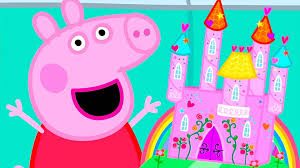
They are the models for the kids as they see them every day and would love to see them on a regular basis can be added in website designing for kids since they like to be followed whatever they do and they also imitate the same thing in their real life.
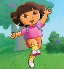
Kids like to see these smiling faces of Dora, the energetic Peppa , the happy Mickey Mouse and the beautiful Barbie as they can contribute to a happy experience for the kids and can bring a smile on their faces.
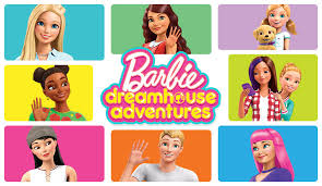
Kids always look and think for magical lands with fairies and castles and beautiful angels with their happy faces as it can take them to that dreamland which we all love to visit will make website desigining more attractive if incorporated.
Creativity gives wings to their imagination which the website designers make use to make their websites look more beautiful and colourful too.
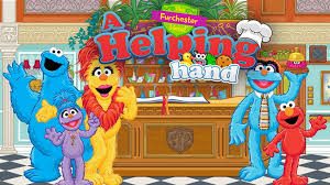
Kids don’t like to browse for information rather they look for instant gratification and pleasure.
So when website designing is done all these things should be kept in mind as these attractive element only add more value to these websites rather mundane detailing and lots of information.
Out of all these factors the most important factor in website designing for kids is colours play.
Its an important role in making the website look more bright and appealing for the kids.
Colours speak volumes about the products being shown.
These colours makes the website visually pleasing and and more authentic.
Different pastel colours on the kids websites sets the tone and complete the playful nature of the website.
Each and every colour being used in these websites has a meaning and an ability to trigger the psychological senses of the kids.
Like the purple colour of Sofia’s dress and her amulet which she wears always has an appeal.
Peppa Pig has a pink dress whereas Mickey Mouse looks cute with that red and black dress.
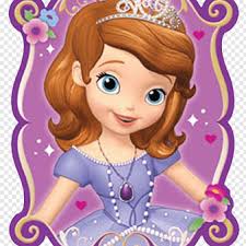
Bright colours with sounds attract the attention of the kids fast and makes it more user friendly and becomes their favourite website as they can relate well with these characters and always think and behave like them.
A web designer is always hungry for creative satisfaction as this is one of the most satisfying professions where there is no room for boredom and inactivity.
If you want to be your own boss, create brands earn a handsome salary and would love to work across the world then this is the place for you which can help you get your dream job.
So if these things really excite you and make you think more then this profession is your calling and what more can you ask for if all this is meant for kids which makes it more beautiful and blissful.
You can get in touch with our representatives for more information on this or call us @9836321595 and they will guide you with all your queries and help you get your best job.


