Whether one is building a new brand from scratch or creating new product color of the graphic design may have a huge impact on its overall message and effectiveness .
Some color combinations for your graphic design project may have the power to captivate the attention, generate emotion and thus ultimately make a long lasting effect.
Combining color on color wheel –The key to successful color combination is understanding how different colors thus communicate with each other.
Mastering the color wheel and color harmonies will help to combine color, build a better brand and knowledgeably communicate with the graphic designers and printers.
The color wheel consists of three primary colors red yellow blue , three secondary colors green , orange purple and six tertiary colors blue green or red violet.
If one is looking to redesign a logo and if one wants to choose eye-catching brand colors for the first time , then color is very much important .
A logo is a very important element for in a brand. It is an iconic graphic design that sits at the top of the letter head and it adorns every piece of packaging and it has a prideful presence on the front page of the website.
So what does it mean to create one that represents the best.

Why do color combinations matter for your graphic design ?
The importance of your color palette shouldn’t be underestimated.
If one is looking at Pantone color of the year an industry wide celebration of color and affirmation that single shade may speak volumes of the brand.
Everyone has a different process but one might find that color is one of the final pieces of the design puzzle. One may lock the new logo or business card and one might color it all in the end.
If one considers color combinations as a fundamental part of the image one may find the design takes a whole new dimension.
How to find colors that might go together.
Trusty color combination might be found using the color wheel.
But one might find it is an art class gem from school. It remains an important tool for everyday design to create a strong color palette.
In order to find complementary colors simply look at the opposing side of the wheel.
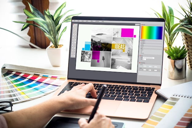
Here are some of the best color combinations that define a style.
Black and White – A top color combination, it is simple timeless faultless.
Leaf and green – This eye catching color palette is a classic choice for health brands as these shades suggest freshness.
Baby pink and blue – Innocent elegant feminine and perfect for brands that want a soft dreamy appeal like skin care and beauty businesses.
Cool greys and blues – Icy and calm it is perfect for wintery design
A cool color combination if there ever was one.
PantoneClassic Blue with white – A timeless way to evoke night like charm and calm collected vibe these two make a great color combination.
Pink and grey – A mix of feminine pink and earthy urban grey this palette is both modern and timeless, making it one of the best color combinations.
Blue and pastel pink – Combining blue and pastel pink creates a nice balance.
Pink’s softer spring – Like pastel aesthetics alongside blue hints of aristocracy creates a serene like duality of balance and harmony .
These contrasting colors generally create refined feminine tranquility ideal for health wellness brands.
Dark Charcoal bright yellow – Dark charcoal and white yellow form a visually striking , high contrasting color combination , paired together these color feel energetic and contemporary making the ideal color palette for cutting edge design agencies , dynamic athletic sportswear and urban lifestyle brands.
Light red and yellow – The bold and vibrant color combination of light red and yellow is a thing to cheer for.
One might reimagine this classic ketchup and mustard color painting with a modern pastel take by changing the tints from red to coral for children’s logo and branding and youth focussed food and beverage packaging.
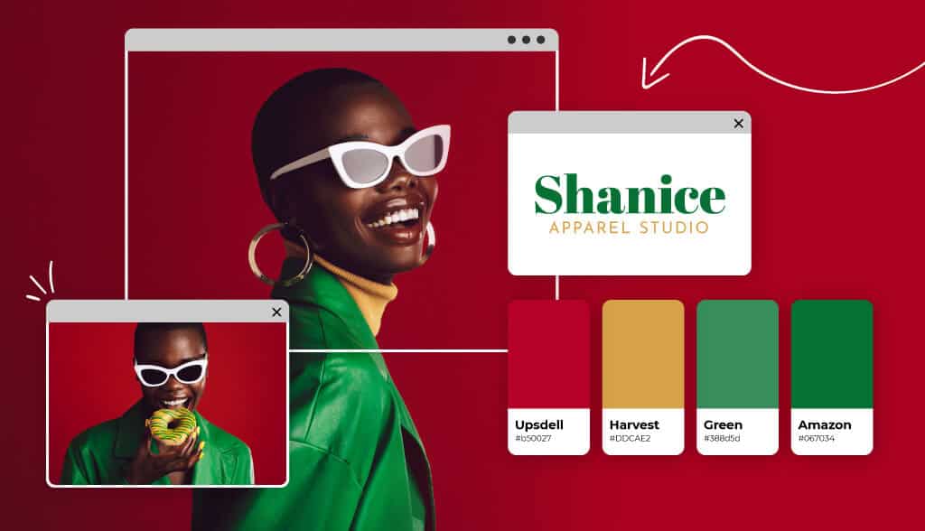
Cherry red and offwhite – Cherry red and offwhite are truly versatile classics .
Defined by the duality of classic and timeless, elegant, interfering and inviting this color combination is very much ideal for luxury fashion and accessories brand fine dining and hospitality industry and romantic bridal branding.
Baby blue and white – Another classic combination is baby blue and white This heavenly combo combination communicates ease and trustworthiness thus helping us to get a feeling of looking up at the sky on a sunny morning.
Sky blue and bubblegum pink – A popular classic combination sky blue and bubblegum pink is a playful and bright combo that communicates alot of joy.
These bright colors are ideal for parenting brands, childcare logos, children apparel, products and toys.

Dark blue and light blue – One shouldn’t overlook different shades of color in this light and blue combo.
Authoritative and cultivated color combo inspires professionalism and trust making it an excellent color palette for insurance agencies for financial service firms.
So these types of best color combinations might inspire the next design.
One might use these types of color combination to bring new life to the creative project or one might use a color picker tool to find new color ideas .
If one is feeling the inspiration one should give these color combinations a new start by getting it started in the webflow.
Join MAAC Kolkata to learn more about graphic design and its color combinations.
@9836321595 MAAC CHOWRINGHEE
@9836321789 MAAC RASHBEHARI
@9830390356 MAAC ULTADANGA
